

Yellow Hello everyone,
Welcome to Alts Sunday Edition 👋
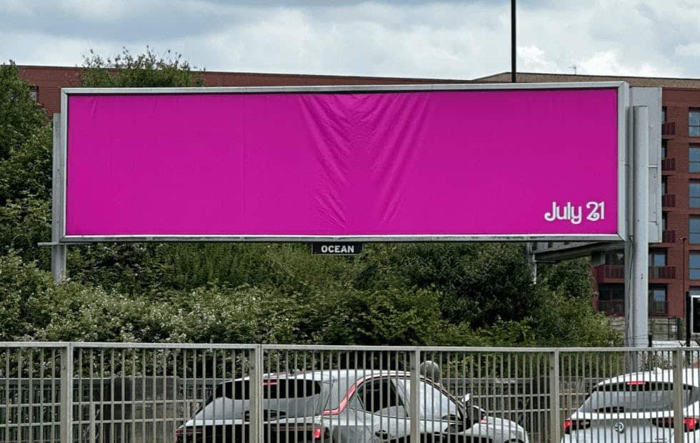
Over the past week, Barbie’s marketing machine has turned the world pink. London turned pink. Barbie’s all-pink Malibu beach house is on Airbnb (completely sold out). Even Google search results are pink.
Barbie has long been synonymous with a very specific shade of pink. You know the one. You’re picturing it as you read this. It’s the pinkest of all the pinks, the bubblegum pink, the Barbie Pink.
And Mattel is ready to go to war over it. Why?
Because you can actually own a color.
That’s right. Welcome to the world of Big Color. 👇
Table of Contents
The history of color ownership
If there’s one company you need to know about here, it’s Pantone.
Think of Pantone as the global authority on color. They created a proprietary matching system which became the global standard. Pantone’s model is used by designers around the world to communicate colors accurately, regardless of the medium or location.
According to their system, there are 1,867 shades of solid Pantone colors, each with a specific number. (More on this company later.)
Meanwhile, companies can (and do) register trademarks for specific colors. But this only started happening in the 1980s.
The product to shatter this legal precedent wasn’t Coca-Cola red, or McDonald’s yellow, or UPS brown.
It was fiberglass insulation.
The insulation wars
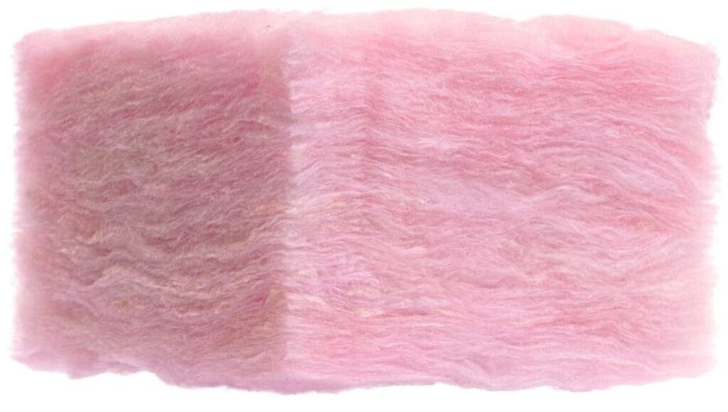
The mid-1950s were a bull market for insulation, but competition was ruthless.
One company, Owens Corning, was suffering amid extreme competition and on the verge of bankruptcy. They needed something to set themselves apart.
Their idea? To infuse their fiberglass insulation, which they believed was the best in the market, with a pink dye.
The plan worked like a charm. For the next 30 years, their pink insulation became world-famous. You may not have heard of the company, but if you installed insulation in the 70s or 80s, it was probably from them.
The company even forged a partnership with The Pink Panther:
By the 1980s, frustrated competitors began to market their own pink insulation. So in 1985, Owens Corning went straight to the US Trademark Office, which initially denied its request to trademark the color “Think Pink.”
Not to be discouraged, the company appealed this decision and won after a five-year battle.
With that, Owens Corning officially became the first American company to successfully trademark a color.
How do you own a color?
The court found that color can only be trademarked under three circumstances:
- The color distinguishes the company from its competition
- The color does not affect the product’s cost or quality
- The color does not serve a functional purpose
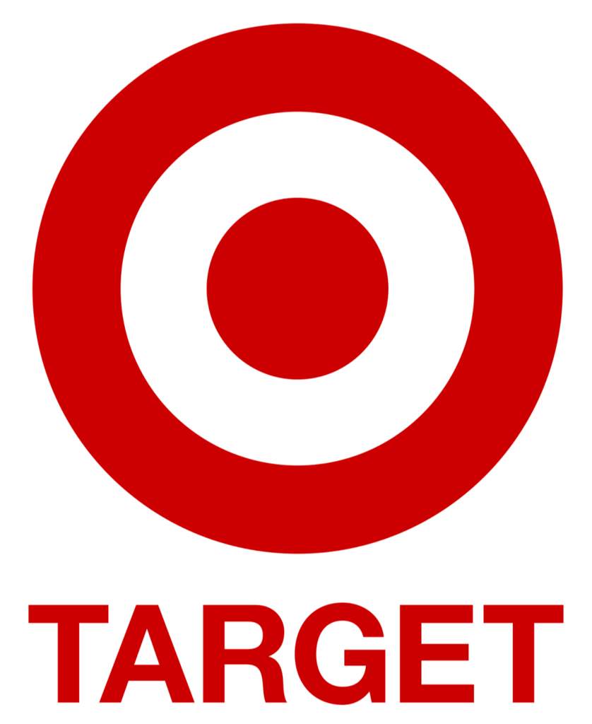
The first point here is the most important one. Target and Wendy’s both use the same shade of red. But Target couldn’t sue Wendy’s. The trademark is only relevant to actual competitors — meaning businesses in the same industry.
Cadbury is another great example here. It trademarked the dark purple on its chocolate bar wrappers known as “Cadbury Purple” — a distinctive shade that has graced the company’s labels for 200 years.
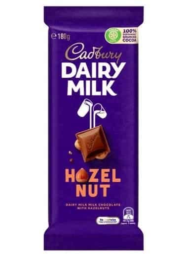
But rivals (mostly Nestlé) relentlessly challenged this trademark. Courts have since ruled that Cadbury’s 1995 trademark only extends to “chocolate in bar or tablet form.”
This means you’re now welcome to release a line of shampoo using that exact shade of purple.
In fact, competitors are even making drinking chocolate using that exact purple color. Cadbury can’t do a thing about it.
What’s the deal with Pantone?
While companies can trademark individual colors, the company laughing all the way to the bank is Pantone (or more accurately, Danaher Corporation ($DHR), which in 2012 acquired Pantone for $468 million.)
Forget owning a single color — these guys essentially manage the entire color ecosystem.
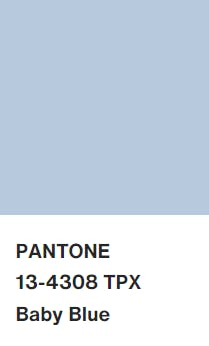
Picture this: It’s the 1960s, and you want to print a blue logo for your new business. You hire a designer and tell them you want to use a “baby blue” for all your signs, business cards, and letterheads.
The designer nods and goes to a printing company.
Unfortunately, this specific printing company’s baby blue is actually more of a greenish-blue. The designer brings you back the logo, but it looks nothing like what you intended. You tell the designer to find another printer with a better version of baby blue. The designer sighs and trudges off. Now you’re both mad.
This is the exact problem Pantone solved. They created the first-ever color-matching system in 1963 – a system that’s still used today. It became the industry standard for color matching among printers, designers, and businesses.
Now, you could tell your designer you want Pantone 13-4308 and have it perfectly replicated across all products.
So, in a roundabout way, Pantone became the unofficial owner of every color in the world.
Okay, they don’t own the actual colors themselves. But they trademarked their index, meaning the name and code of each color is uniquely theirs.
The company certainly has fun with its proprietary index. Each year they put out the “Color of the Year Award.” (2023’s color of the year is Viva Magenta)
This color here is called Pantone 448 C. Pantone dubbed it “the ugliest color in the world.”
Pantone makes a lot of money. Whenever a business wants to use Pantone’s color-matching service, they have to pay a fee.
This has become controversial, especially for Adobe users, who must now either cough up for a premium license or go back to the good old CMYK system.
Meanwhile, Danaher Corp has a market cap of $192 billion. That’s higher than Target and Starbucks combined, and nearly as high as McDonald’s.
So yeah. Pantone is a big deal when it comes to owning colors.
A copper supply shock is coming ⛏️
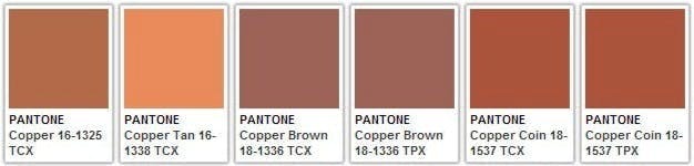
Copper is a color, but it’s also a rare earth element.
You may have heard that Chile, the world’s largest copper supplier, is looking to nationalize its mining industry. This could cause international mining companies to flee.
The world’s 2nd and 3rd largest suppliers are Peru and the Democratic Republic of the Congo. Politics and war are affecting copper supply in both of these countries as well.
In a nutshell, the copper market is in a difficult spot right now.
This supply crunch threatens 45% of the world’s copper supply. But it could be extremely bullish for copper prices and specific mining companies that have a ready stockpile of copper.
Fat Tail Investment Research publishes several deep dive into those mining companies.
If you’re interested in this world, they have a daily publication called Fat Tail Commodities. Check it out.
What colors might land you in court?
Barbie Pink
Yes, Barbie pink is a real color. But interestingly, there aren’t any official trademarks associated with it.
Since 2001, Mattel has gone to the US Trademarks Office several times to trademark Barbie Pink. Each time their applications were abandoned before completion. (They’ve never even gotten far enough to be officially rejected!)
However, the current Barbie-mania bodes well for Mattel. If they want to make another application in the future, they could point to a renewed brand association with the color.
If you force-feed a color onto society, you can create a “distinct secondary meaning” for the color.
And that may be enough to finally land Mattel a trademark on pink.
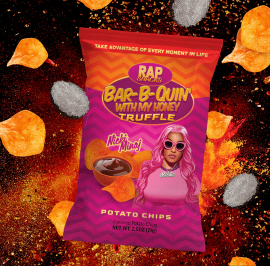
Of course, the fact that Mattel has yet to trademark Barbie Pink hasn’t stopped them from suing competitors.
Last year, Rap Snacks and Nicki Minaj received court summons for their Bar-B-Quin’ potato chips. Mattel claimed the likeness and use of pink created a false association with the Barbie brand.
But my favorite court case involving Barbie Pink was back in 1997 over, you guessed it, the bubblegum pop song Barbie Girl by Aqua.
On top of using the Barbie name, Mattel complained about the music video’s use of pink and white colors commonly associated with their brand.
Mattel ended up losing the case for a couple of reasons:
- Mattel could not prove that Barbie Pink had gained a secondary meaning, and therefore could not be trademarked.
- The song was deemed a parody, and therefore protected by freedom of speech laws. (This is the same loophole ”Weird Al” Yankovic uses)
The judge finished his ruling with perhaps the coolest one-liner ever: “The parties are advised to chill.”
Tiffany Blue
Ahh, Tiffany blue.
This shade has been associated with the luxury jewelry brand ever since Tiffany’s Blue Book was published 178 years ago.
The color’s actual name is “Robin Egg Blue.” Here’s why:
Tiffany Blue was one of the first corporate colors to get trademarked, and it’s easy to see why. After splashing it on everything they own for hundreds of years, in 1998 it was decided the color had earned a secondary meaning.
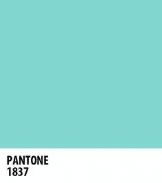
In fact, Tiffany Blue is so recognizable that the company worked with Pantone to create a custom color in their matching system. Its Pantone index number is 1837 — the year Tiffany & Co was founded.
Again, this trademark extends only to companies in the same space as Tiffany & Co.
It’s unlikely that a healthcare company using this exact color in its logo would be infringing on the Tiffany Blue trademark.
T-Mobile Magenta
Some companies trademark colors and aren’t particularly protective of them. Others sue anybody that thinks about using their color.
T-Mobile is an example of the latter.
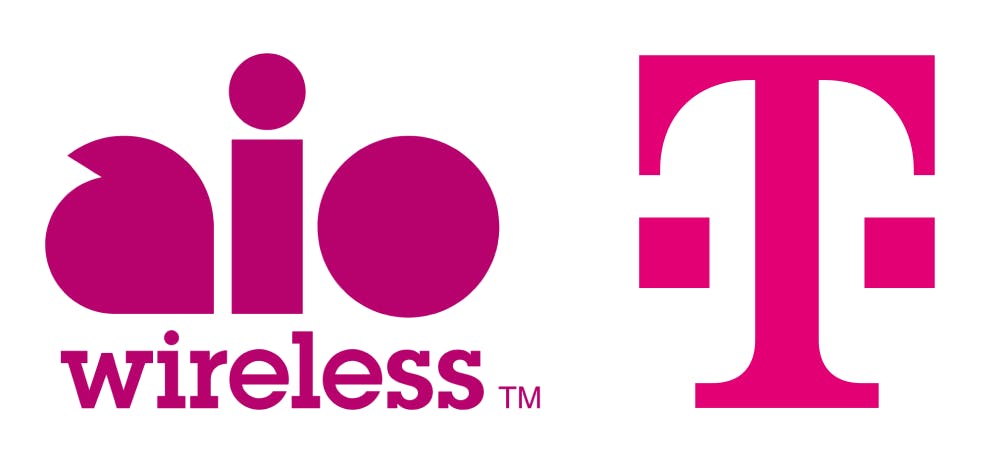
The telco giant uses Pantone Rhodamine Red U, which they trademarked as T-Mobile Magenta in 2008.
Over the past 15 years, they’ve waged war with anyone who looks remotely like an enemy.
In 2014, T-Mobile sued rival telecom Aio Wireless over the use of its “plum-colored branding.” Even though Aio wasn’t even using the same Pantone shade, T-Mobile won the case.
Aio dropped its advertising and eventually merged with Cricket Wireless, which was later bought by AT&T.
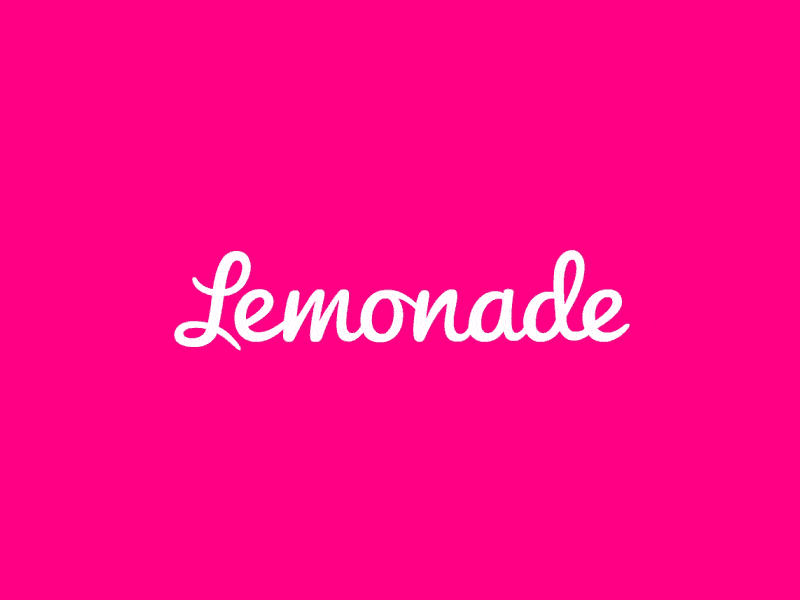
T-Mobile took insurance startup Lemonade to court over their use of a similar shade of magenta. Lemonade’s CEO, Daniel Schreiber, was livid.
The idea that a company can trademark…one of the three ink cartridges in every printer in the world…just defies belief. – Lemonade CEO Daniel Schreiber
Schreiber ultimately had the last laugh, with a French court ruling Lemonade both used a different color and competed in a different market.
And thank God. What an awful precedent that would have set.
What other colors are trademarked?
Majorelle Blue
This deep, intense shade known as Majorelle Blue was created by artist Jacques Majorelle.
His art piece in Marrakech, Morocco uses the color, which he successfully trademarked in the 1930s before his death.
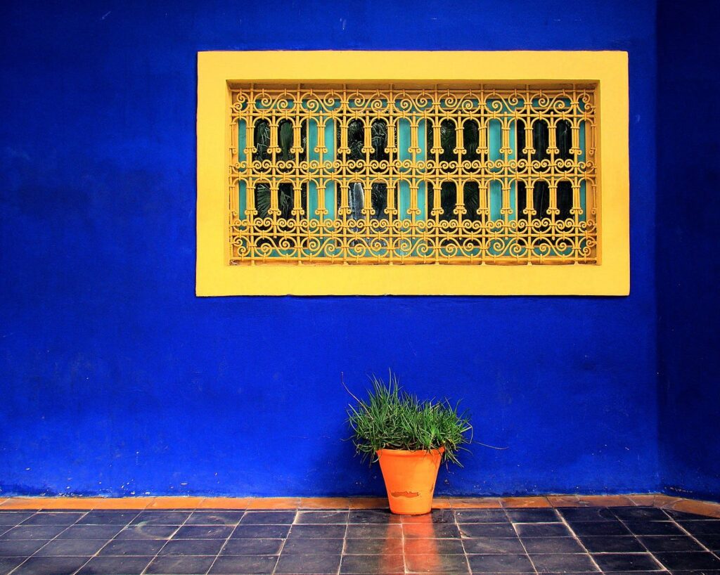
The custom-made shade is created using Lapus Lazuli, a pigment used by the ancient Egyptians, and considered the world’s “most perfect color.”
UPS Brown (“Pullman Brown”)
In the early 1900s, brown was a popular color for the wealthy due to the luxurious Pullman Dover rail cars. UPS copied this color for their trucks and employee uniforms.
Nearly a century later, in 1998, UPS finally trademarked its distinct shade of brown.
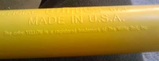
Wiffle Ball Yellow
This is perhaps the most obscure trademarked color out there.
Wiffle Ball is similar to baseball (a few weeks ago were talking about Wiffle Ball as an alternative sport.) From the beginning, wiffle bats have traditionally been yellow.
In 2008 the organization behind the sport took things to the next level when they successfully trademarked Wiffle Ball yellow.
Closing thoughts
When I first started writing this issue, I thought the idea of color ownership was pretty insane.
After all, colors are just wavelengths in the electromagnetic spectrum. To me, this is like being able to trademark the note B-flat, or the smell of grass.
As it turns out, color ownership doesn’t really mean what you think it does. Remember, even companies that have successfully trademarked specific colors can’t prevent companies outside their industry from using them.
Color is essentially just another logo attribute — meaning it has to be protected and defended like anything else in the messy world of intellectual property law.
These laws are ultimately designed to protect consumers and prevent confusion in the marketplace. Where it gets tricky is proving a company has created a distinct secondary meaning for a color. But hey, that’s why lawyers get paid so much.
Another thing I realized while writing this issue is that I wonder if Pantone has a good reason to exist.
Sure, it takes lots of effort to produce an accurate color reference system. And I can see how the company was incredibly important and useful before the Internet!
But now, it seems like they no longer add much to the equation. Today, colors have all sorts of official alpha-numeric references. There are a million sites that convert RGB/CMYK/Hex color equivalents to Pantone colors, and vice-versa.
Am I mistaken in thinking Pantone Colors are just a rose by any other name? They were the first to index, but the world has moved on. Why do they still matter?
In any event, I’m thankful it’s not easy to trademark a color. Last year, five million businesses were created in the US alone. If any company could easily claim ownership of any color, we’d run out pretty damn quickly. 🍭
Further reading
- The signature blue we use for our logo and links is #0066FF, also known as “Blue Ribbon.” (And yes, our Alts logo has a trademark)
- Not everyone’s happy about colors getting trademarked. Color depletion theory has been used to prevent protection of colors.
- When you take an image on your phone, the colors vary wildly based on lighting, color temperature, and your phone’s software. Pantone has developed some helpful, affordable technology to solve this.
- Is Pantone’s parent company starting to go after Adobe?
- I found SecureYourTrademark to be very helpful when writing this issue. It seemed like every time I searched for something, his site came up. The guy is an IP lawyer with red-hot SEO skills.
- Encycolorpedia was also helpful, and also has a great SEO game.
- Color blindness is more common than you think! 1 in 12 men are color blind (8%), while just 1 in 200 women are (0.5%). Statistically, 5,464 people reading this issue have some form of color blindness.
- It is possible to trademark a smell, but it’s rare. I’ll write an issue on this topic someday.
- YInMn Blue is the product of a chemical accident, but is now considered the world’s best color. It’s vibrant and stunning. You just gotta see it.
- Crayola turned this into a crayon, and held a contest to name it. The winning name is pretty cool: “Bleutiful.”
- Atmos offers a great read on how poisonous substances have been used to create colors over the years: The Toxic History of Color
- Apparently, English speakers can describe warm colors better than cool ones.
- Finally, Vantablack is the darkest, blackest color known to science. It absorbs 99.97% of light, and the exclusive rights to the color are owned by sculptor Sir Anish Kapoor.
Disclosures
- This issue was sponsored by our friends at Fat Tail Investment Research.
- Our ALTS 1 Fund has no investments in any companies or entities mentioned in this issue.
- This issue contains affiliate links to TradingView. If you click and sign up, we get a few bucks.
- I am long $DHR